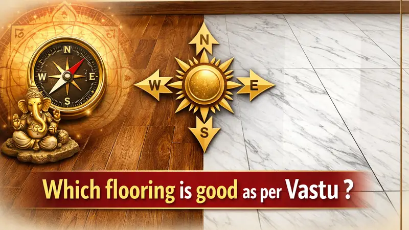
Flooring Vastu: Which Flooring Is Good as Per Vastu?
Flooring affects the feel of a home more than most people realize. It is not just a design choice. It changes how a room looks, how open it feels, and how comfortable it becomes over time.
That is why so many people search for answers around flooring vastu, Vastu tiles, and which flooring is good as per Vastu. They are not only choosing a tile. They are trying to make the home feel more balanced, peaceful, and easy to live in.
The safest flooring choices as per Vastu are usually light, earthy, and visually calm. In most homes, shades like off-white, cream, beige, light brown, and soft grey work well because they do not make the room feel heavy.
A floor covers a large part of the home. So when the flooring is too dark, too glossy, too busy, or too harsh, the entire space can start feeling uncomfortable. On the other hand, when the flooring looks simple and settled, the room often feels cleaner and more welcoming.
Which flooring is good as per Vastu?
Light and natural-looking flooring is usually considered best as per Vastu. This includes shades such as white, cream, beige, light brown, sand tones, and soft earthy colours.
These colours are preferred because they create a stable and open feeling. They also blend more easily with furniture, wall colours, and natural light. In practical terms, they are much easier to live with than extreme shades that dominate the room.
The material matters too. Flooring should not only look right. It should also feel right in daily life. Smooth, durable, easy-to-maintain flooring usually works better than a fashionable option that becomes difficult to clean or uncomfortable to use.
So when people ask which flooring is good as per Vastu, the simple answer is this: choose flooring that feels calm, balanced, clean, and stable.
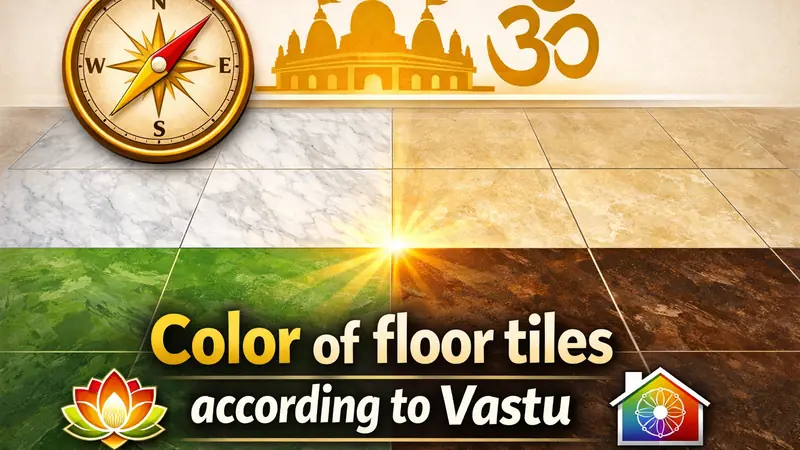
Color of floor tiles according to Vastu
The best colour of floor tiles according to Vastu is usually a light or earthy shade. That is the safest choice for most homes.
Off-white, cream, beige, light brown, warm neutrals, and soft grey are commonly preferred because they make a room feel brighter and more settled. These colours also suit both modern and traditional interiors without creating visual stress.
Very dark floor tiles are usually approached with caution. That is because dark flooring can make a room feel smaller, heavier, or less open, especially when the space already has limited light.
This does not mean every dark tile is wrong. It simply means the floor should not overpower the room. A good floor colour supports the space. It should not fight with it.
Bathroom floor tiles colour as per Vastu
Bathroom floor tiles should feel clean, light, and easy on the eyes. That is why lighter shades are usually preferred in Vastu-based choices.
White, cream, light grey, and soft blue are common options for bathroom flooring. These colours make the bathroom feel fresher and often make smaller bathrooms appear less cramped.
Bathrooms are functional spaces, so this is one area where practicality matters a lot. The flooring should not only look balanced but also be safe and easy to maintain. A matte or anti-skid finish often makes more sense than a shiny surface.
Dark bathroom floors are usually avoided when the space is already small or poorly lit. A heavy-looking bathroom can start feeling closed and uncomfortable very quickly.
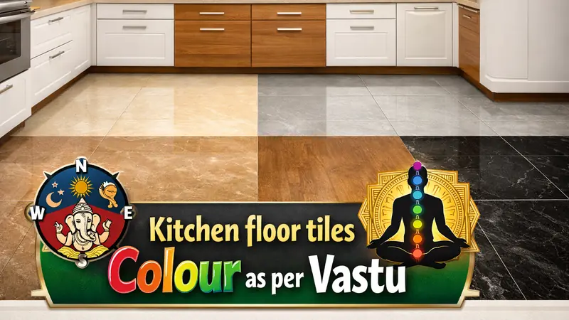
Kitchen floor tiles colour as per Vastu
Kitchen flooring should feel warm, grounded, and practical. That is why soft earthy colours usually work best.
Beige, cream, sand tones, light brown, and muted warm neutrals are generally good choices for kitchen floor tiles colour as per Vastu. These shades feel steady and also handle everyday use better than very bright or very dark flooring.
The kitchen is a high-use area. Spills, stains, movement, and regular cleaning all matter here. So the floor should feel balanced without becoming difficult to manage.
If the kitchen is small, lighter flooring can help it feel more open. If it is used heavily every day, earthy shades often feel more forgiving and realistic than pure white tiles.
Bedroom floor tiles colour as per Vastu
Bedroom flooring should help the room feel restful. It should not feel loud, cold, or visually tiring.
That is why bedroom floor tiles colour as per Vastu is usually kept in soft, warm, and grounding shades. Beige, light brown, cream, muted earthy tones, and warm neutrals are often the best fit.
A bedroom is where the mind is supposed to settle down. If the flooring is too shiny, too dark, or too dramatic, the space can start feeling less comfortable than it should.
For most bedrooms, simpler is better. Flooring that quietly supports the room often works far better than flooring that tries to become the center of attention.
Black flooring Vastu
Black flooring is not always forbidden, but it is usually used carefully. This is where many people get confused.
Black floors can look elegant in photos. But in real homes, they often make a room feel heavier, darker, and more closed, especially when used across a large area.
That is why black flooring Vastu is usually discussed with caution. In bedrooms, kitchens, and small bathrooms, full black flooring is often not the most comfortable choice. It can reduce the soft and open feeling that most people want from a home.
Still, black flooring does not always need to be removed in panic. If you already have it, balance becomes important. Lighter walls, better lighting, less visual clutter, and softer furniture tones can reduce the heaviness.
So the real issue is not the colour alone. It is how dominant the black flooring becomes in the room.
Vastu tips for floor tiles
Floor tiles should look calm before they look trendy. That one principle can prevent many mistakes.
Choose colours that feel easy to live with. A floor stays in the house for years, so it should not feel tiring after a few weeks.
Keep the flooring visually stable. Too many patterns, too many colour breaks, and too much contrast can make the home feel restless.
Avoid cracked, broken, or uneven flooring. Even a good colour loses its value when the floor itself feels damaged or neglected.
Match the tile choice to the room. Bathroom floor tiles colour as per Vastu will not be the same as bedroom or kitchen tile choices. Each room has a different purpose, so the flooring should support that purpose.
Balance Vastu with function. Wet areas need grip. Busy areas need durability. Small rooms need brightness. Beautiful flooring is useful only when it also works in real life.
Vastu Tiles for modern homes
The best Vastu tiles are usually the ones that feel balanced and practical together. People often overcomplicate this.
In modern homes, it makes more sense to choose tiles that are simple, clean-looking, and easy to maintain. Light earthy shades, matte finishes, anti-skid bathroom tiles, and calm bedroom flooring usually work better than loud or extreme choices.
You do not need every tile in the home to follow a rigid formula. What matters more is that the overall flooring does not create heaviness, confusion, or discomfort.
A home feels better when the flooring supports the space quietly. That is usually a better choice than chasing a dramatic look that becomes difficult to live with.
Which floor is good as per Vastu in high-rise building?
In high-rise homes, the floor number matters less than people think. This is one of the most misunderstood parts of Vastu.
Some people believe only lower floors are good. Others think very high floors are automatically a problem. But in real life, the quality of the flat matters just as much as the floor number.
When people ask which floor is good as per Vastu in high-rise building, the more useful answer is this: a well-planned flat with good light, good airflow, balanced direction, and a comfortable layout will often feel better than a badly planned flat on a supposedly better floor.
So instead of focusing only on floor number, look at the entire living experience. Does the home feel open? Does it get enough light? Is the layout comfortable? Does the space feel settled once you enter it?
That gives a more realistic answer than a single fixed rule.
Which flooring is good as per Vastu in practical terms?
The best flooring is the one that creates comfort without visual heaviness. That is the most practical way to understand it.
For most homes, this means:
light colours,
earthy shades,
simple finishes,
room-appropriate materials,
and flooring that feels stable instead of dramatic.
If a floor makes the room feel brighter, calmer, and easier to maintain, it is already doing a lot right.
If a floor makes the room feel dark, crowded, slippery, or harsh, it usually needs a second thought no matter how expensive it is.
Final thoughts
Flooring problems do not stay small for long. If the colour feels too dark, the finish feels too harsh, or the room starts feeling heavy every day, that discomfort slowly becomes part of daily life.
That is why it makes sense to get clarity before finalizing the flooring. A thoughtful choice now can save regret later. And if your home has confusing directions, black flooring, or a high-rise layout that is hard to judge, getting proper guidance can help you make a decision that feels right both practically and emotionally.
English FAQs
Which flooring is good as per Vastu?
Light, earthy, and natural-looking flooring is usually considered the best choice.
What is the ideal colour of floor tiles according to Vastu?
Cream, beige, off-white, light brown, and other soft neutral shades are generally preferred.
What are good bathroom floor tiles colours as per Vastu?
White, cream, soft blue, and light grey are usually safe and popular choices.
What are good kitchen floor tiles colours as per Vastu?
Beige, sand, warm neutrals, and light brown shades usually work well.
What are good bedroom floor tiles colours as per Vastu?
Soft earthy tones, beige, cream, and warm light browns are often considered ideal.
Is black flooring bad in Vastu?
Not always, but it is usually used carefully because too much black can make a room feel heavy.
Which floor is good as per Vastu in high-rise building?
The overall flat layout, light, and comfort matter more than depending only on the floor number.
Hindi Transcript (हिंदी प्रतिलेख)
फ्लोरिंग वास्तु: वास्तु के अनुसार कौन-सी फ्लोरिंग अच्छी मानी जाती है?
फ्लोरिंग घर के एहसास को जितना बदल देती है, उतना लोग अक्सर समझ नहीं पाते। यह केवल एक डिज़ाइन पसंद नहीं है। यह बदल देती है कि कमरा कैसा दिखता है, कितना खुला महसूस होता है, और समय के साथ कितना आरामदायक बनता है।
इसीलिए बहुत से लोग फ्लोरिंग वास्तु, वास्तु टाइल्स, और वास्तु के अनुसार कौन-सी फ्लोरिंग अच्छी मानी जाती है जैसे सवालों के जवाब खोजते हैं। वे केवल एक टाइल नहीं चुन रहे होते। वे घर को अधिक संतुलित, शांत और रहने में आसान बनाना चाहते हैं।
वास्तु के अनुसार सबसे सुरक्षित फ्लोरिंग विकल्प आमतौर पर हल्के, मिट्टी जैसे और देखने में शांत माने जाते हैं। ज़्यादातर घरों में ऑफ-व्हाइट, क्रीम, बेज, हल्का भूरा और सॉफ्ट ग्रे जैसे शेड्स अच्छे लगते हैं क्योंकि वे कमरे को भारी महसूस नहीं होने देते।
फर्श घर के बड़े हिस्से को कवर करता है। इसलिए जब फ्लोरिंग बहुत गहरी, बहुत चमकदार, बहुत भरी हुई या बहुत तेज़ लगती है, तो पूरा स्थान असहज लगने लगता है। दूसरी तरफ, जब फ्लोरिंग सरल और संतुलित दिखती है, तो कमरा अक्सर अधिक साफ़ और स्वागतयोग्य महसूस होता है।
वास्तु के अनुसार कौन-सी फ्लोरिंग अच्छी मानी जाती है?
हल्की और प्राकृतिक दिखने वाली फ्लोरिंग आमतौर पर वास्तु के अनुसार सबसे अच्छी मानी जाती है। इसमें सफेद, क्रीम, बेज, हल्का भूरा, सैंड टोन और सॉफ्ट अर्थी रंग शामिल हैं।
इन रंगों को इसलिए पसंद किया जाता है क्योंकि वे स्थिरता और खुलापन महसूस कराते हैं। ये फर्नीचर, दीवारों के रंग और प्राकृतिक रोशनी के साथ भी आसानी से घुल-मिल जाते हैं। व्यवहारिक रूप से देखें तो ये उन अतिशय रंगों की तुलना में कहीं आसान होते हैं जो पूरे कमरे पर हावी हो जाते हैं।
मटेरियल भी मायने रखता है। फ्लोरिंग केवल सही दिखनी ही नहीं चाहिए। उसे रोज़मर्रा की ज़िंदगी में सही महसूस भी होना चाहिए। चिकनी, टिकाऊ और साफ़ रखने में आसान फ्लोरिंग अक्सर उस फैशनेबल विकल्प से बेहतर होती है जिसे साफ़ करना मुश्किल हो जाए या इस्तेमाल में असहज लगे।
तो जब लोग पूछते हैं कि वास्तु के अनुसार कौन-सी फ्लोरिंग अच्छी मानी जाती है, तो सीधा जवाब यह है: ऐसी फ्लोरिंग चुनें जो शांत, संतुलित, साफ़ और स्थिर महसूस हो।
वास्तु के अनुसार फर्श की टाइल्स का रंग
वास्तु के अनुसार फर्श की टाइल्स का सबसे अच्छा रंग आमतौर पर हल्का या मिट्टी जैसा शेड माना जाता है। ज़्यादातर घरों के लिए यही सबसे सुरक्षित विकल्प होता है।
ऑफ-व्हाइट, क्रीम, बेज, हल्का भूरा, वार्म न्यूट्रल और सॉफ्ट ग्रे आमतौर पर पसंद किए जाते हैं क्योंकि ये कमरे को अधिक उजला और संतुलित महसूस कराते हैं। ये रंग आधुनिक और पारंपरिक दोनों तरह के इंटीरियर में बिना किसी दृश्य तनाव के अच्छे लगते हैं।
बहुत गहरे रंग की फ्लोर टाइल्स को आमतौर पर सावधानी के साथ देखा जाता है। इसका कारण यह है कि गहरी फ्लोरिंग कमरे को छोटा, भारी या कम खुला महसूस करा सकती है, खासकर जब जगह में पहले से ही रोशनी कम हो।
इसका मतलब यह नहीं है कि हर गहरे रंग की टाइल गलत है। इसका सीधा मतलब सिर्फ इतना है कि फर्श कमरे पर हावी नहीं होना चाहिए। एक अच्छा फ्लोर रंग कमरे का साथ देता है। उसे उससे लड़ना नहीं चाहिए।
वास्तु के अनुसार बाथरूम फ्लोर टाइल्स का रंग
बाथरूम की फ्लोर टाइल्स साफ़, हल्की और आंखों को आराम देने वाली महसूस होनी चाहिए। इसी वजह से वास्तु-आधारित चुनावों में हल्के रंगों को आमतौर पर प्राथमिकता दी जाती है।
सफेद, क्रीम, हल्का ग्रे और सॉफ्ट ब्लू बाथरूम फ्लोरिंग के लिए आम विकल्प हैं। ये रंग बाथरूम को अधिक ताज़ा महसूस कराते हैं और अक्सर छोटे बाथरूम को कम तंग दिखाते हैं।
बाथरूम उपयोगी स्थान होते हैं, इसलिए यहां व्यवहारिकता बहुत मायने रखती है। फ्लोरिंग केवल संतुलित दिखनी ही नहीं चाहिए, बल्कि सुरक्षित और साफ़ रखने में आसान भी होनी चाहिए। मैट या एंटी-स्किड फिनिश अक्सर चमकदार सतह की तुलना में अधिक समझदारी भरा विकल्प होती है।
गहरे रंग के बाथरूम फर्श से आमतौर पर बचा जाता है जब जगह पहले से ही छोटी हो या वहां रोशनी कम हो। भारी दिखने वाला बाथरूम बहुत जल्दी बंद और असहज महसूस होने लगता है।
वास्तु के अनुसार किचन फ्लोर टाइल्स का रंग
किचन की फ्लोरिंग गर्माहट, स्थिरता और व्यवहारिकता का एहसास देनी चाहिए। यही कारण है कि सॉफ्ट अर्थी रंग आमतौर पर सबसे बेहतर माने जाते हैं।
बेज, क्रीम, सैंड टोन, हल्का भूरा और म्यूटेड वार्म न्यूट्रल आमतौर पर वास्तु के अनुसार किचन फ्लोर टाइल्स के लिए अच्छे विकल्प माने जाते हैं। ये शेड्स स्थिर महसूस होते हैं और बहुत चमकीली या बहुत गहरी फ्लोरिंग की तुलना में रोज़मर्रा के इस्तेमाल को भी बेहतर संभालते हैं।
किचन बहुत अधिक उपयोग में आने वाली जगह है। यहां गिरना, दाग, आवाजाही और नियमित सफाई—सब मायने रखते हैं। इसलिए फर्श संतुलित लगना चाहिए, लेकिन उसे संभालना मुश्किल नहीं होना चाहिए।
अगर किचन छोटा है, तो हल्की फ्लोरिंग उसे अधिक खुला महसूस करा सकती है। अगर वह रोज़ भारी इस्तेमाल में आता है, तो मिट्टी जैसे शेड्स अक्सर बिल्कुल सफेद टाइल्स की तुलना में अधिक व्यवहारिक और सहज लगते हैं।
वास्तु के अनुसार बेडरूम फ्लोर टाइल्स का रंग
बेडरूम की फ्लोरिंग कमरे को आरामदायक महसूस कराने में मदद करनी चाहिए। उसे बहुत तेज़, बहुत ठंडी या आंखों को थकाने वाली नहीं लगनी चाहिए।
इसी वजह से वास्तु के अनुसार बेडरूम फ्लोर टाइल्स का रंग आमतौर पर सॉफ्ट, वार्म और ग्राउंडिंग शेड्स में रखा जाता है। बेज, हल्का भूरा, क्रीम, म्यूटेड अर्थी टोन और वार्म न्यूट्रल अक्सर सबसे अच्छे विकल्प होते हैं।
बेडरूम वह जगह है जहां मन को शांत होना चाहिए। अगर फ्लोरिंग बहुत चमकदार, बहुत गहरी या बहुत नाटकीय लगे, तो कमरा उतना आरामदायक महसूस नहीं होता जितना होना चाहिए।
ज़्यादातर बेडरूम के लिए सरलता बेहतर रहती है। ऐसी फ्लोरिंग जो चुपचाप कमरे का साथ दे, अक्सर उस फ्लोरिंग से बेहतर होती है जो खुद ही ध्यान का केंद्र बनने की कोशिश करे।
ब्लैक फ्लोरिंग वास्तु
ब्लैक फ्लोरिंग हमेशा वर्जित नहीं होती, लेकिन इसे आमतौर पर बहुत सोच-समझकर इस्तेमाल किया जाता है। यहीं पर बहुत से लोग उलझन में पड़ जाते हैं।
ब्लैक फ्लोर तस्वीरों में शानदार दिख सकता है। लेकिन असली घरों में यह अक्सर कमरे को ज़्यादा भारी, ज़्यादा अंधेरा और ज़्यादा बंद महसूस कराता है, खासकर जब इसे बड़े हिस्से में इस्तेमाल किया जाए।
इसीलिए ब्लैक फ्लोरिंग वास्तु पर आमतौर पर सावधानी के साथ बात की जाती है। बेडरूम, किचन और छोटे बाथरूम में पूरी तरह ब्लैक फ्लोरिंग अक्सर सबसे आरामदायक विकल्प नहीं होती। यह उस सॉफ्ट और खुले एहसास को कम कर सकती है जो ज़्यादातर लोग अपने घर में चाहते हैं।
फिर भी, ब्लैक फ्लोरिंग होने का मतलब यह नहीं है कि उसे घबराकर तुरंत हटाना ही पड़े। अगर आपके घर में पहले से यह है, तो संतुलन ज़रूरी हो जाता है। हल्की दीवारें, बेहतर रोशनी, कम दृश्य अव्यवस्था और नरम फर्नीचर टोन इसकी भारीपन को कम कर सकते हैं।
तो असली मुद्दा केवल रंग नहीं है। मुद्दा यह है कि कमरे में ब्लैक फ्लोरिंग कितनी हावी हो जाती है।
फ्लोर टाइल्स के लिए वास्तु टिप्स
फ्लोर टाइल्स ट्रेंडी दिखने से पहले शांत दिखनी चाहिए। यही एक सिद्धांत कई गलतियों से बचा सकता है।
ऐसे रंग चुनें जिनके साथ लंबे समय तक रहना आसान लगे। फर्श कई सालों तक घर में रहता है, इसलिए कुछ हफ्तों बाद ही वह थकाऊ नहीं लगना चाहिए।
फ्लोरिंग को दृश्य रूप से स्थिर रखें। बहुत ज़्यादा पैटर्न, बहुत ज़्यादा रंगों के बदलाव, और बहुत ज़्यादा कंट्रास्ट घर को बेचैन महसूस करा सकते हैं।
टूटी, फटी या असमान फ्लोरिंग से बचें। अच्छा रंग भी अपना महत्व खो देता है जब फर्श खुद ही खराब या उपेक्षित लगे।
टाइल का चुनाव कमरे के हिसाब से करें। वास्तु के अनुसार बाथरूम फ्लोर टाइल्स का रंग, बेडरूम या किचन टाइल्स जैसा नहीं होगा। हर कमरे का उद्देश्य अलग होता है, इसलिए फ्लोरिंग को उसी उद्देश्य का साथ देना चाहिए।
वास्तु और व्यवहारिकता में संतुलन रखें। गीले हिस्सों को पकड़ चाहिए। ज़्यादा इस्तेमाल वाले हिस्सों को टिकाऊपन चाहिए। छोटे कमरों को रोशनी चाहिए। सुंदर फ्लोरिंग तभी उपयोगी है जब वह असल जीवन में काम भी करे।
आधुनिक घरों के लिए वास्तु टाइल्स
सबसे अच्छी वास्तु टाइल्स आमतौर पर वही होती हैं जो संतुलन और व्यवहारिकता दोनों का एहसास दें। लोग अक्सर इसे जरूरत से ज्यादा जटिल बना देते हैं।
आधुनिक घरों में ऐसी टाइल्स चुनना अधिक समझदारी भरा होता है जो सरल दिखें, साफ-सुथरी लगें और संभालने में आसान हों। हल्के अर्थी शेड्स, मैट फिनिश, बाथरूम के लिए एंटी-स्किड टाइल्स, और बेडरूम के लिए शांत फ्लोरिंग आमतौर पर बहुत तेज़ या अतिशय विकल्पों से बेहतर काम करती है।
घर की हर टाइल को किसी कठोर नियम का पालन करने की ज़रूरत नहीं है। ज़्यादा महत्वपूर्ण यह है कि पूरी फ्लोरिंग मिलकर भारीपन, उलझन या असहजता पैदा न करे।
घर तब बेहतर महसूस होता है जब फ्लोरिंग चुपचाप उस जगह का साथ देती है। यह अक्सर उस नाटकीय लुक के पीछे भागने से बेहतर होता है जिसके साथ रहना बाद में मुश्किल हो जाए।
हाई-राइज़ बिल्डिंग में वास्तु के अनुसार कौन-सी फ्लोर अच्छी होती है?
हाई-राइज़ घरों में फ्लोर नंबर उतना मायने नहीं रखता जितना लोग सोचते हैं। यह वास्तु के सबसे गलत समझे जाने वाले हिस्सों में से एक है।
कुछ लोग मानते हैं कि केवल निचली मंज़िलें अच्छी होती हैं। कुछ लोग सोचते हैं कि बहुत ऊंची मंज़िलें अपने आप में समस्या होती हैं। लेकिन असल जीवन में फ्लैट की गुणवत्ता भी फ्लोर नंबर जितनी ही महत्वपूर्ण होती है।
जब लोग पूछते हैं कि हाई-राइज़ बिल्डिंग में वास्तु के अनुसार कौन-सी फ्लोर अच्छी होती है, तो अधिक उपयोगी जवाब यह है: अच्छा प्रकाश, अच्छा वेंटिलेशन, संतुलित दिशा और आरामदायक लेआउट वाला एक सही ढंग से बना फ्लैट, कथित रूप से बेहतर फ्लोर पर बने खराब फ्लैट की तुलना में अधिक अच्छा महसूस हो सकता है।
इसलिए केवल फ्लोर नंबर पर ध्यान देने के बजाय पूरे रहने के अनुभव को देखें। क्या घर खुला महसूस होता है? क्या उसे पर्याप्त रोशनी मिलती है? क्या लेआउट आरामदायक है? क्या अंदर प्रवेश करते ही जगह संतुलित महसूस होती है?
यही एक तय नियम की तुलना में अधिक वास्तविक जवाब देता है।
व्यवहारिक रूप से वास्तु के अनुसार कौन-सी फ्लोरिंग अच्छी मानी जाती है?
सबसे अच्छी फ्लोरिंग वही है जो दृश्य भारीपन के बिना आराम पैदा करे। इसे समझने का यही सबसे व्यवहारिक तरीका है।
ज़्यादातर घरों के लिए इसका मतलब है:
हल्के रंग,
मिट्टी जैसे शेड्स,
सरल फिनिश,
कमरे के अनुसार सही मटेरियल,
और ऐसी फ्लोरिंग जो नाटकीय होने के बजाय स्थिर महसूस हो।
अगर कोई फर्श कमरे को अधिक उजला, शांत और संभालने में आसान महसूस कराता है, तो वह पहले ही बहुत कुछ सही कर रहा है।
अगर कोई फर्श कमरे को अंधेरा, भरा हुआ, फिसलन भरा या कठोर महसूस कराता है, तो उसे दोबारा सोचने की ज़रूरत होती है, चाहे वह कितना भी महंगा क्यों न हो।
अंतिम विचार
फ्लोरिंग की समस्याएं लंबे समय तक छोटी नहीं रहतीं। अगर रंग बहुत गहरा लगे, फिनिश बहुत कठोर लगे, या कमरा रोज़ भारी महसूस होने लगे, तो वह असहजता धीरे-धीरे रोज़मर्रा की ज़िंदगी का हिस्सा बन जाती है।
इसीलिए फ्लोरिंग को अंतिम रूप देने से पहले स्पष्टता लेना समझदारी होती है। अभी किया गया एक सोच-समझकर फैसला बाद के पछतावे से बचा सकता है। और अगर आपके घर में दिशाओं को लेकर उलझन है, ब्लैक फ्लोरिंग है, या हाई-राइज़ लेआउट को समझना मुश्किल है, तो सही मार्गदर्शन आपको ऐसा फैसला लेने में मदद कर सकता है जो व्यवहारिक और भावनात्मक—दोनों स्तरों पर सही लगे।
हिंदी FAQs
वास्तु के अनुसार कौन-सी फ्लोरिंग अच्छी मानी जाती है?
हल्की, मिट्टी जैसी और प्राकृतिक दिखने वाली फ्लोरिंग आमतौर पर सबसे अच्छा विकल्प मानी जाती है।
वास्तु के अनुसार फर्श की टाइल्स का आदर्श रंग क्या है?
क्रीम, बेज, ऑफ-व्हाइट, हल्का भूरा और अन्य सॉफ्ट न्यूट्रल शेड्स आमतौर पर पसंद किए जाते हैं।
वास्तु के अनुसार बाथरूम फ्लोर टाइल्स के लिए कौन-से रंग अच्छे हैं?
सफेद, क्रीम, सॉफ्ट ब्लू और हल्का ग्रे आमतौर पर सुरक्षित और लोकप्रिय विकल्प हैं।
वास्तु के अनुसार किचन फ्लोर टाइल्स के लिए कौन-से रंग अच्छे हैं?
बेज, सैंड, वार्म न्यूट्रल और हल्के भूरे शेड्स आमतौर पर अच्छे काम करते हैं।
वास्तु के अनुसार बेडरूम फ्लोर टाइल्स के लिए कौन-से रंग अच्छे हैं?
सॉफ्ट अर्थी टोन, बेज, क्रीम और वार्म हल्के भूरे रंग अक्सर आदर्श माने जाते हैं।
क्या ब्लैक फ्लोरिंग वास्तु में खराब मानी जाती है?
हमेशा नहीं, लेकिन इसे आमतौर पर सावधानी से इस्तेमाल किया जाता है क्योंकि बहुत अधिक ब्लैक रंग कमरे को भारी महसूस करा सकता है।
हाई-राइज़ बिल्डिंग में वास्तु के अनुसार कौन-सी फ्लोर अच्छी होती है?
केवल फ्लोर नंबर पर निर्भर करने के बजाय पूरे फ्लैट का लेआउट, रोशनी और आराम अधिक मायने रखते हैं।