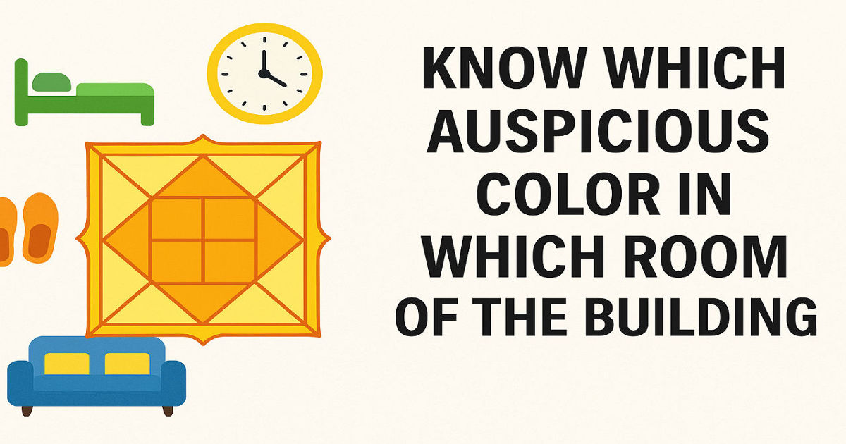
Know Which Auspicious Color in Which Room of the Building
When people search Know which auspicious color in which room of the building, they are usually not looking for decoration advice alone. They are trying to solve a feeling inside the home. Why does one room feel peaceful while another feels heavy? Why does one bedroom help you relax, while another starts to feel restless after sunset? In Vastu-based colour selection, the most practical approach is to look at two things together: the direction of the room and the purpose of the room. That is why the same shade does not work equally well everywhere, and why choosing only by personal liking often leaves the space looking fine but feeling unsettled.
A Simple Rule Before Going Room by Room
If you want a simple rule before going room by room, start with this: use light, breathable colours as the base of the house, then make direction-based adjustments where needed. This works because most current Vastu-oriented colour guides repeatedly favour white, off-white, beige, light yellow, pale blue, soft green, and earthy neutrals over very dark or visually heavy shades. So should every room be painted in the same light tone? Not really. The idea is not to make the whole home look flat. The idea is to give each room the right emotional job: calm where you sleep, openness where you gather, clarity where you work, and purity where you pray.

Colors According to Vastu Direction
East Wall Colour as Per Vastu
When people ask about Colors according to Vastu direction, the east side is one of the most common concerns. The East wall colour as per Vastu is usually kept light, clean, and fresh. White is the most repeated choice, and soft variations like off-white, light green, pale blue, or soft beige also fit well when the room needs a little more warmth. Why is this direction treated so carefully? Because east-facing spaces are associated with light, freshness, and a sense of beginning, so the colour should not block that mood. If your east wall already gets good daylight, a soft white or warm cream can feel enough. If it feels too plain, a muted pastel can keep the wall alive without making it loud.
South West Wall Colour as Per Vastu
The South West wall colour as per Vastu should be handled differently. This is the part of the home where most guides shift toward earthy tones, stable neutrals, and grounding shades. Beige, sand, taupe, cream, light brown, muted mustard, and soft clay-based tones usually fit better here than bright whites or overly glossy colours. Why do so many people struggle with the south-west wall? Because they either make it too dark and oppressive, or too stark and empty. The more balanced approach is to create steadiness without heaviness. A south-west wall should feel supportive, not dramatic. If one wall in the room is to carry more visual weight, this is often the place to use a slightly deeper earthy shade while keeping the remaining walls softer.

Hall or Living Room Colours
For the hall or living room, most current guidance leans toward openness, welcome, and ease. That usually means whites, creams, warm beige, pale yellow, soft sage, or other light pastels rather than dense dark tones. Why do people often feel their hall is “good but dull” or “stylish but tiring”? Usually because the colour is too heavy for a room meant for conversation, movement, guests, and shared family time. A living room does not need aggressive colour to feel alive. It needs enough lightness to feel socially warm. If the room is east or north facing, soft white, cream, or light green works well. If it gets less natural light, warm beige or pale yellow can help it feel more active without turning harsh.
Bedroom Colours
South West Bedroom Colour as Per Vastu
The bedroom needs a more careful answer, especially when people search South west bedroom colour as per Vastu. This is where many homeowners want clarity because the south-west bedroom is often treated as the master bedroom. The safest direction for colour here is earthy, restful, and emotionally steady. Cream, beige, light brown, muted yellow, soft peach in limited use, and calm neutral blends tend to work better than strong reds, black, or overly intense contrast. What do most people really want from this room? Better sleep, emotional steadiness, less irritation, and a sense of security. That is exactly why the south-west bedroom is usually kept grounded rather than flashy. If you want the room to feel richer, add texture through fabric or wood tones, not through loud wall colour.
Kitchen Colours
The kitchen is one room where people often overdo the colour. They assume energy means bright paint, but too much heat in the palette can make the room feel sharp instead of balanced. Across current guides, the kitchen usually works better in warm but controlled shades like soft yellow, light peach, gentle coral, muted orange, or clean white depending on the room’s direction and light. So what should you do if the kitchen is already small or dark? Avoid very dark grey or black as dominant wall colours, because they tend to make the room feel compressed. A kitchen should feel active and clean, not visually heavy. In practical terms, light warm shades usually age better and sit more comfortably with stainless steel, stone, and daily use.
Pooja Room Colours
The pooja room needs the least experimentation and the most restraint. When people are unsure which colour supports prayer, clarity, and mental quiet, the usual answer remains white first, then very soft yellow, pale blue, or a restrained light pink. The reason is simple: the room should feel clean, inward, and undisturbed. Should you make the pooja room bright and decorative because it is sacred? Usually no. Too much visual force weakens the quietness that this space is meant to hold. A pooja room does not need to impress anyone. It needs to help the mind settle.

Study Room or Home Office Colours
For a study room or home office, people often ask for a colour that supports focus without making the room feel cold. That is why soft green, light blue, gentle yellow, and calm off-white remain common choices in study-related Vastu guidance. Why do these colours keep appearing? Because they sit between alertness and ease. A study room painted too dark can feel mentally packed, while one that is too bright can feel distracting. If the room is used for long hours, go for a light base and keep stronger colour in smaller elements like a chair, artwork, or shelf backing instead of covering every wall.
Bathrooms, Balconies, and Utility Areas
Bathrooms, balconies, and utility areas are often ignored, yet they still affect the overall feel of the home. Current room-wise colour advice tends to favour light blue, white, pale green, cream, and other airy shades in these spaces. Why does that matter when these rooms are not used for long? Because even short-use spaces affect the flow of the house. A bathroom that feels too dark can make the adjoining bedroom feel dull. A balcony painted in a fresh, light tone can make the entire edge of the home feel more breathable. These are not dramatic changes, but they are noticeable over time.
How Direction and Room Function Work Together
One important point that many pages mention but do not explain deeply enough is this: direction and room function should work together, not fight each other. For example, if a room falls in the south-west but is being used as a bedroom, the colour should still remain grounding and restful. If a room is east-facing but used for meditation or quiet reading, a soft white or pale pastel may work better than anything too energetic. And if you are confused because different pages suggest slightly different shades, follow the common principle instead of chasing exact paint names: lighter for openness, earthy for stability, soft warm tones for welcome, and avoid excess darkness where calm or clarity is needed.
Common Mistakes People Make
The biggest mistakes happen when colour is chosen only by trend. A dramatic charcoal wall may look modern, but does it help a pooja room, a family bedroom, or a study feel easier to live with? In most cases, no. The same goes for overusing black, dark red, or heavy grey in areas that are supposed to support sleep, prayer, or family interaction. Another common mistake is painting every room in a different strong colour, which makes the house feel restless rather than aligned. A better home usually comes from consistency, not constant visual noise.
Why This Choice Matters
In the end, the real value of understanding Know which auspicious color in which room of the building is not just that your walls look better. It is that the home begins to support the way you want to live inside it. If the east wall feels brighter, the south-west bedroom feels steadier, and the hall feels more welcoming, the result is practical, not theoretical. And if you have already tried random colour choices and the house still feels off, it is better to correct the problem with clarity now rather than let that discomfort settle into daily life. When a home keeps feeling slightly unbalanced room after room, thoughtful guidance from an experienced Vastu-aware astrologer like Prateek Kapoor can help you make fewer wrong changes and arrive at a calmer result.
English FAQs
Why does one room feel peaceful while another feels heavy?
One room may feel peaceful while another feels heavy because colour, direction, and room purpose are not aligned. In Vastu-based colour selection, the feeling of a space depends on how well the colour supports the room’s direction and function.
Why does one bedroom help you relax while another feels restless?
A bedroom may feel relaxing or restless depending on whether the colour supports calmness and stability. If colours are too strong, dark, or mismatched with direction, the room may feel uncomfortable instead of restful.
Should every room be painted in the same light tone?
No, every room should not be painted in the same light tone. The idea is to use light colours as a base but adjust them based on the room’s purpose and direction so that each space supports a specific emotional function.
Why is the east wall colour kept light and fresh as per Vastu?
The east wall colour is kept light and fresh because this direction is associated with light, freshness, and new beginnings. Light colours like white, soft green, or pale blue help maintain that natural energy.
Why do people struggle with the south-west wall colour?
People struggle with the south-west wall because they either make it too dark and heavy or too plain and empty. The right approach is to use earthy and balanced tones that create stability without heaviness.
Why does the living room feel dull or tiring despite good design?
A living room may feel dull or tiring if the colour is too heavy for a space meant for interaction and movement. Lighter, warm tones help create a more welcoming and comfortable environment.
What do people really want from a bedroom?
Most people want better sleep, emotional stability, less irritation, and a sense of security from their bedroom. That is why calm, earthy, and balanced colours are preferred.
What should you do if the kitchen is already small or dark?
If the kitchen is small or dark, avoid very dark colours like deep grey or black. Use light warm shades such as soft yellow or light peach to make the space feel open and active.
Should the pooja room be bright and decorative?
No, the pooja room should not be overly bright or decorative. It should feel calm, clean, and undisturbed, which is why light colours like white or soft pastels are preferred.
Why do certain colours repeat in study room recommendations?
Colours like light green, light blue, and off-white are repeated because they balance alertness and calmness. They help maintain focus without making the room feel too heavy or distracting.
Why do bathroom and balcony colours matter even if used less?
Bathroom and balcony colours still matter because they affect the overall flow of the home. Even short-use spaces can influence how connected or heavy the surrounding rooms feel.
How should direction and room function work together?
Direction and room function should support each other. For example, a south-west bedroom should use grounding colours, while an east-facing meditation space should use light and calm tones.
What happens when colours are chosen only based on trends?
Choosing colours based only on trends can make rooms look modern but feel uncomfortable. Strong or dark colours may not support sleep, relaxation, or focus in daily life.
Why is it better to maintain colour consistency in a home?
Maintaining colour consistency helps the home feel balanced and connected. Using too many strong or different colours can make the space feel restless and visually noisy.
Why does choosing the right colour for each room matter?
Choosing the right colour matters because it affects how the home feels and supports daily life. The right colours can create calmness, stability, and comfort across different rooms.
Hindi Transcript
जानें किस कमरे में कौन सा शुभ रंग होना चाहिए
जब लोग खोजते हैं कि जानें किस कमरे में कौन सा शुभ रंग होना चाहिए, तो वे केवल सजावट की सलाह नहीं ढूंढ रहे होते। वे घर के अंदर एक एहसास को समझना चाहते हैं। क्यों एक कमरा शांत महसूस होता है जबकि दूसरा भारी लगता है? क्यों एक बेडरूम आपको आराम देता है, जबकि दूसरा शाम के बाद बेचैनी पैदा करता है? वास्तु आधारित रंग चयन में सबसे व्यावहारिक तरीका यह है कि दो चीज़ों को साथ देखा जाए: कमरे की दिशा और कमरे का उपयोग। यही कारण है कि एक ही रंग हर जगह समान रूप से काम नहीं करता, और केवल पसंद के आधार पर रंग चुनने से घर दिखने में तो अच्छा लगता है, लेकिन महसूस करने में असंतुलित रह जाता है।
कमरे के अनुसार जाने से पहले एक सरल नियम
यदि आप कमरे के अनुसार जाने से पहले एक सरल नियम चाहते हैं, तो यह अपनाएं: घर के आधार के रूप में हल्के और सहज रंगों का उपयोग करें, फिर आवश्यकता के अनुसार दिशा के आधार पर बदलाव करें। ऐसा इसलिए काम करता है क्योंकि अधिकांश वास्तु-आधारित रंग मार्गदर्शिकाएँ सफेद, ऑफ-व्हाइट, बेज, हल्का पीला, हल्का नीला, हल्का हरा और प्राकृतिक न्यूट्रल रंगों को गहरे या भारी रंगों की तुलना में अधिक प्राथमिकता देती हैं। तो क्या हर कमरे को एक ही हल्के रंग में रंग देना चाहिए? बिल्कुल नहीं। उद्देश्य पूरे घर को एक जैसा बनाना नहीं है। उद्देश्य यह है कि हर कमरे को उसका सही भावनात्मक काम दिया जाए: जहां आप सोते हैं वहां शांति, जहां आप मिलते हैं वहां खुलापन, जहां आप काम करते हैं वहां स्पष्टता, और जहां आप पूजा करते हैं वहां पवित्रता।
दिशा के अनुसार वास्तु रंग
पूर्व दिशा की दीवार का रंग वास्तु के अनुसार
जब लोग दिशा के अनुसार वास्तु रंगों के बारे में पूछते हैं, तो पूर्व दिशा सबसे आम चिंताओं में से एक होती है। पूर्व दिशा की दीवार का रंग वास्तु के अनुसार आमतौर पर हल्का, साफ और ताज़गी भरा रखा जाता है। सफेद सबसे अधिक चुना जाने वाला रंग है, और इसके साथ ऑफ-व्हाइट, हल्का हरा, हल्का नीला या हल्का बेज भी अच्छे विकल्प हैं जब कमरे को थोड़ी गर्माहट की ज़रूरत हो। इस दिशा को इतना महत्व क्यों दिया जाता है? क्योंकि पूर्व दिशा प्रकाश, ताज़गी और नई शुरुआत से जुड़ी होती है, इसलिए रंग उस भावना को बाधित नहीं करना चाहिए। यदि आपकी पूर्व दिशा की दीवार पर पहले से अच्छी रोशनी आती है, तो हल्का सफेद या क्रीम पर्याप्त होता है। यदि यह बहुत साधारण लगे, तो हल्का पेस्टल रंग इसे जीवंत बना सकता है बिना इसे ज़्यादा तेज बनाए।
दक्षिण-पश्चिम दीवार का रंग वास्तु के अनुसार
दक्षिण-पश्चिम दिशा की दीवार का रंग वास्तु के अनुसार अलग तरीके से संभालना चाहिए। यह घर का वह हिस्सा है जहां अधिकतर मार्गदर्शिकाएँ प्राकृतिक, स्थिर और संतुलित रंगों की ओर जाती हैं। बेज, सैंड, टौप, क्रीम, हल्का भूरा, हल्का मस्टर्ड और मिट्टी जैसे रंग यहां अधिक उपयुक्त होते हैं, बजाय चमकीले सफेद या बहुत चमकदार रंगों के। लोग दक्षिण-पश्चिम दीवार के साथ क्यों संघर्ष करते हैं? क्योंकि वे इसे या तो बहुत गहरा बना देते हैं या बहुत खाली छोड़ देते हैं। सही तरीका यह है कि स्थिरता बनाई जाए बिना भारीपन के। दक्षिण-पश्चिम दीवार सहारा देने वाली होनी चाहिए, न कि नाटकीय। यदि कमरे में एक दीवार को थोड़ा अधिक महत्व देना हो, तो यही वह स्थान है जहां थोड़ा गहरा प्राकृतिक रंग उपयोग किया जा सकता है जबकि बाकी दीवारें हल्की रखी जाती हैं।
हॉल या लिविंग रूम के रंग
हॉल या लिविंग रूम के लिए, अधिकांश मार्गदर्शन खुलापन, स्वागत और सहजता पर केंद्रित होता है। इसका मतलब है सफेद, क्रीम, गर्म बेज, हल्का पीला, हल्का हरा या अन्य हल्के पेस्टल रंग, न कि गहरे और भारी रंग। लोग अक्सर क्यों महसूस करते हैं कि उनका हॉल “अच्छा लेकिन फीका” या “स्टाइलिश लेकिन थकाने वाला” है? आमतौर पर इसका कारण यह होता है कि रंग उस कमरे के लिए बहुत भारी होता है जो बातचीत, गतिविधि और परिवार के समय के लिए बना है। लिविंग रूम को जीवंत महसूस करने के लिए तेज रंगों की ज़रूरत नहीं होती। उसे सामाजिक गर्माहट के लिए हल्कापन चाहिए। यदि कमरा पूर्व या उत्तर दिशा में है, तो सफेद, क्रीम या हल्का हरा अच्छा काम करता है। यदि उसमें प्राकृतिक रोशनी कम है, तो गर्म बेज या हल्का पीला उसे अधिक सक्रिय बना सकता है बिना उसे कठोर बनाए।
बेडरूम के रंग
दक्षिण-पश्चिम बेडरूम का रंग वास्तु के अनुसार
बेडरूम के लिए उत्तर थोड़ा अधिक सावधानी की मांग करता है, खासकर जब लोग दक्षिण-पश्चिम बेडरूम का रंग वास्तु के अनुसार खोजते हैं। यह वह स्थान है जहां लोग स्पष्टता चाहते हैं क्योंकि दक्षिण-पश्चिम बेडरूम को अक्सर मुख्य बेडरूम माना जाता है। यहां के लिए सबसे सुरक्षित रंग प्राकृतिक, शांत और स्थिर होते हैं। क्रीम, बेज, हल्का भूरा, हल्का पीला, सीमित उपयोग में हल्का पीच और शांत न्यूट्रल रंग तेज लाल, काले या बहुत अधिक कॉन्ट्रास्ट वाले रंगों से बेहतर होते हैं। लोग वास्तव में इस कमरे से क्या चाहते हैं? बेहतर नींद, भावनात्मक स्थिरता, कम तनाव और सुरक्षा का एहसास। यही कारण है कि दक्षिण-पश्चिम बेडरूम को सामान्यतः स्थिर रखा जाता है, न कि आकर्षक। यदि आप कमरे को समृद्ध महसूस कराना चाहते हैं, तो टेक्सचर या लकड़ी के टोन का उपयोग करें, न कि तेज रंगों का।
किचन के रंग
किचन एक ऐसा कमरा है जहां लोग अक्सर रंग के साथ अधिक प्रयोग कर देते हैं। वे मानते हैं कि ऊर्जा का मतलब तेज रंग है, लेकिन बहुत अधिक गर्म रंग कमरे को संतुलित बनाने के बजाय तीखा बना सकते हैं। अधिकांश मार्गदर्शिकाओं में किचन के लिए हल्के और संतुलित गर्म रंग जैसे हल्का पीला, हल्का पीच, हल्का ऑरेंज या सफेद बेहतर माने जाते हैं, जो दिशा और रोशनी पर निर्भर करते हैं। यदि किचन पहले से छोटा या अंधेरा है तो क्या करें? गहरे ग्रे या काले रंग से बचें, क्योंकि वे जगह को और छोटा महसूस कराते हैं। किचन को सक्रिय और साफ महसूस होना चाहिए, न कि भारी। व्यावहारिक रूप से, हल्के गर्म रंग लंबे समय तक बेहतर रहते हैं और दैनिक उपयोग में भी संतुलित दिखते हैं।
पूजा कक्ष के रंग
पूजा कक्ष में सबसे कम प्रयोग और सबसे अधिक सादगी की आवश्यकता होती है। जब लोग यह समझना चाहते हैं कि कौन सा रंग प्रार्थना और मानसिक शांति को समर्थन देता है, तो उत्तर अक्सर सफेद होता है, फिर हल्का पीला, हल्का नीला या हल्का गुलाबी। इसका कारण सरल है: यह स्थान साफ, शांत और केंद्रित होना चाहिए। क्या पूजा कक्ष को आकर्षक और सजावटी बनाना चाहिए क्योंकि यह पवित्र है? आमतौर पर नहीं। बहुत अधिक दृश्य प्रभाव शांति को कम कर देता है। पूजा कक्ष को प्रभावित करने की नहीं, बल्कि मन को शांत करने की आवश्यकता होती है।
स्टडी रूम या होम ऑफिस के रंग
स्टडी रूम या होम ऑफिस के लिए लोग अक्सर ऐसा रंग चाहते हैं जो ध्यान बढ़ाए लेकिन कमरे को ठंडा न बनाए। यही कारण है कि हल्का हरा, हल्का नीला, हल्का पीला और ऑफ-व्हाइट आमतौर पर सुझाए जाते हैं। ये रंग बार-बार क्यों सामने आते हैं? क्योंकि ये सतर्कता और सहजता के बीच संतुलन बनाते हैं। बहुत गहरा रंग मानसिक दबाव पैदा कर सकता है, जबकि बहुत तेज रंग ध्यान भटका सकता है। यदि कमरे का उपयोग लंबे समय तक होता है, तो हल्के रंग को आधार बनाएं और गहरे रंगों को छोटे तत्वों में रखें जैसे कुर्सी या सजावट।
बाथरूम, बालकनी और अन्य स्थान
बाथरूम, बालकनी और अन्य स्थान अक्सर नजरअंदाज किए जाते हैं, लेकिन वे घर के पूरे वातावरण को प्रभावित करते हैं। इन स्थानों के लिए हल्का नीला, सफेद, हल्का हरा और क्रीम जैसे रंग बेहतर माने जाते हैं। जब इनका उपयोग कम होता है तो भी इनका महत्व क्यों है? क्योंकि ये पूरे घर के प्रवाह को प्रभावित करते हैं। एक अंधेरा बाथरूम पास के कमरे को भी भारी बना सकता है। एक हल्की बालकनी पूरे घर को अधिक खुला महसूस करा सकती है। ये बदलाव छोटे होते हैं, लेकिन समय के साथ महसूस होते हैं।
दिशा और कमरे के उपयोग का संतुलन
एक महत्वपूर्ण बात जिसे अक्सर बताया जाता है लेकिन गहराई से समझाया नहीं जाता, वह यह है कि दिशा और कमरे का उपयोग साथ काम करना चाहिए। उदाहरण के लिए, यदि कोई कमरा दक्षिण-पश्चिम में है और बेडरूम के रूप में उपयोग हो रहा है, तो रंग स्थिर और शांत होना चाहिए। यदि कोई कमरा पूर्व दिशा में है और ध्यान के लिए उपयोग हो रहा है, तो हल्का सफेद या पेस्टल रंग बेहतर होगा। यदि अलग-अलग सुझाव मिल रहे हों, तो मूल सिद्धांत अपनाएं: हल्के रंग खुलापन देते हैं, प्राकृतिक रंग स्थिरता देते हैं, और बहुत अधिक गहरे रंगों से बचना चाहिए।
आम गलतियाँ
सबसे बड़ी गलती तब होती है जब रंग केवल ट्रेंड के आधार पर चुना जाता है। एक गहरा चारकोल रंग आधुनिक दिख सकता है, लेकिन क्या यह बेडरूम या पूजा कक्ष के लिए सही है? अधिकतर मामलों में नहीं। इसी तरह, बहुत अधिक काला या गहरा लाल रंग नींद और शांति को प्रभावित कर सकता है। एक और गलती है हर कमरे को अलग-अलग तेज रंगों में रंगना, जिससे घर असंतुलित महसूस होता है। एक अच्छा घर निरंतरता से बनता है, न कि लगातार बदलाव से।
यह चयन क्यों महत्वपूर्ण है
अंत में, जानें किस कमरे में कौन सा शुभ रंग होना चाहिए का वास्तविक महत्व केवल यह नहीं है कि आपका घर सुंदर दिखे। यह इस बात से जुड़ा है कि घर आपके जीवन को कैसे समर्थन देता है। यदि पूर्व दिशा उज्जवल लगे, दक्षिण-पश्चिम बेडरूम स्थिर महसूस हो और हॉल स्वागतपूर्ण लगे, तो यह केवल सिद्धांत नहीं बल्कि अनुभव बन जाता है। यदि आपने पहले ही कई रंग बदलकर देख लिए हैं और घर फिर भी असंतुलित महसूस होता है, तो इसे स्पष्ट समझ के साथ ठीक करना बेहतर है। जब घर बार-बार असंतुलित महसूस हो, तो एक अनुभवी वास्तु-समझ रखने वाले ज्योतिषी जैसे प्रातिक कपूर से मार्गदर्शन लेना आपको सही दिशा में ले जा सकता है।
Hindi FAQs
क्यों एक कमरा शांत महसूस होता है जबकि दूसरा भारी लगता है?
एक कमरा शांत और दूसरा भारी इसलिए महसूस हो सकता है क्योंकि रंग, दिशा और कमरे का उपयोग एक-दूसरे के साथ संतुलित नहीं होते। वास्तु के अनुसार रंग चयन में कमरे का अनुभव इस बात पर निर्भर करता है कि रंग उसकी दिशा और उद्देश्य के साथ कितना मेल खाता है।
क्यों एक बेडरूम आपको आराम देता है जबकि दूसरा बेचैनी पैदा करता है?
बेडरूम आरामदायक या बेचैन इस बात पर निर्भर करता है कि रंग शांति और स्थिरता को कितना समर्थन देता है। यदि रंग बहुत तेज, गहरे या दिशा के अनुसार सही नहीं हैं, तो कमरा आराम देने के बजाय असहज महसूस हो सकता है।
क्या हर कमरे को एक ही हल्के रंग में रंगना चाहिए?
नहीं, हर कमरे को एक ही हल्के रंग में रंगना सही नहीं है। हल्के रंग आधार के रूप में उपयोग किए जा सकते हैं, लेकिन कमरे की दिशा और उपयोग के अनुसार उनमें बदलाव करना चाहिए ताकि हर स्थान अपना सही भावनात्मक काम कर सके।
वास्तु के अनुसार पूर्व दिशा की दीवार का रंग हल्का और ताज़ा क्यों रखा जाता है?
पूर्व दिशा की दीवार का रंग हल्का और ताज़ा इसलिए रखा जाता है क्योंकि यह दिशा प्रकाश, ताजगी और नई शुरुआत से जुड़ी होती है। सफेद, हल्का हरा या हल्का नीला जैसे रंग इस प्राकृतिक ऊर्जा को बनाए रखते हैं।
लोग दक्षिण-पश्चिम दीवार के रंग के साथ संघर्ष क्यों करते हैं?
लोग दक्षिण-पश्चिम दीवार के साथ इसलिए संघर्ष करते हैं क्योंकि वे इसे या तो बहुत गहरा और भारी बना देते हैं या बहुत खाली छोड़ देते हैं। सही तरीका यह है कि संतुलित और प्राकृतिक रंगों का उपयोग किया जाए जो स्थिरता दें लेकिन भारीपन न लाएं।
अच्छा डिजाइन होने के बावजूद लिविंग रूम फीका या थकाने वाला क्यों लगता है?
लिविंग रूम फीका या थकाने वाला तब लगता है जब रंग उस जगह के लिए बहुत भारी होता है जो बातचीत और गतिविधियों के लिए बनी होती है। हल्के और गर्म रंग अधिक स्वागतपूर्ण और आरामदायक वातावरण बनाते हैं।
लोग वास्तव में बेडरूम से क्या चाहते हैं?
ज्यादातर लोग अपने बेडरूम से बेहतर नींद, भावनात्मक स्थिरता, कम चिड़चिड़ापन और सुरक्षा का एहसास चाहते हैं। इसलिए शांत, संतुलित और प्राकृतिक रंगों को प्राथमिकता दी जाती है।
यदि किचन पहले से छोटा या अंधेरा है तो क्या करना चाहिए?
यदि किचन छोटा या अंधेरा है, तो गहरे रंग जैसे गहरा ग्रे या काला उपयोग करने से बचें। हल्के गर्म रंग जैसे हल्का पीला या हल्का पीच उपयोग करने से जगह खुली और सक्रिय महसूस होती है।
क्या पूजा कक्ष को चमकदार और सजावटी बनाना चाहिए?
नहीं, पूजा कक्ष को बहुत अधिक चमकदार या सजावटी नहीं बनाना चाहिए। यह स्थान शांत, स्वच्छ और केंद्रित होना चाहिए, इसलिए हल्के रंग जैसे सफेद या हल्के पेस्टल रंग उपयुक्त होते हैं।
स्टडी रूम में कुछ रंग बार-बार क्यों सुझाए जाते हैं?
हल्का हरा, हल्का नीला और ऑफ-व्हाइट जैसे रंग इसलिए बार-बार सुझाए जाते हैं क्योंकि ये सतर्कता और शांति के बीच संतुलन बनाते हैं। ये ध्यान बनाए रखने में मदद करते हैं बिना कमरे को भारी या विचलित करने वाला बनाए।
बाथरूम और बालकनी के रंग कम उपयोग के बावजूद क्यों महत्वपूर्ण हैं?
बाथरूम और बालकनी के रंग इसलिए महत्वपूर्ण हैं क्योंकि वे पूरे घर के प्रवाह को प्रभावित करते हैं। कम उपयोग वाले स्थान भी आसपास के कमरों के अनुभव को बदल सकते हैं।
दिशा और कमरे के उपयोग को साथ कैसे काम करना चाहिए?
दिशा और कमरे का उपयोग एक-दूसरे का समर्थन करना चाहिए। उदाहरण के लिए, दक्षिण-पश्चिम बेडरूम में स्थिर रंग होने चाहिए, जबकि पूर्व दिशा के ध्यान कक्ष में हल्के और शांत रंग बेहतर होते हैं।
जब रंग केवल ट्रेंड के आधार पर चुने जाते हैं तो क्या होता है?
जब रंग केवल ट्रेंड के आधार पर चुने जाते हैं, तो कमरे दिखने में आधुनिक लग सकते हैं लेकिन महसूस करने में असहज होते हैं। बहुत तेज या गहरे रंग नींद, आराम और ध्यान को प्रभावित कर सकते हैं।
घर में रंगों की एकरूपता बनाए रखना क्यों बेहतर है?
रंगों की एकरूपता बनाए रखने से घर संतुलित और जुड़ा हुआ महसूस होता है। बहुत अधिक अलग-अलग या तेज रंगों का उपयोग घर को अस्थिर और अव्यवस्थित बना सकता है।
हर कमरे के लिए सही रंग चुनना क्यों महत्वपूर्ण है?
सही रंग चुनना इसलिए महत्वपूर्ण है क्योंकि यह घर के अनुभव और जीवनशैली को प्रभावित करता है। सही रंग अलग-अलग कमरों में शांति, स्थिरता और आराम का माहौल बनाते हैं।